A desktop platform for yacht management companies and office-based teams
Translating a mobile-first product into a scalable web application — giving finance teams and management offices the oversight, reporting, and account management tools they needed in a professional desktop environment.
Alongside the Starboard Card mobile application, the product expanded into a dedicated web-based platform designed for office-based clients and yacht management companies. The web application was built to complement the onboard mobile experience, providing the same core financial management tools through a more comprehensive desktop interface suited to administrative and operational workflows.
I contributed to the design and evolution of this platform over a three-year period, helping translate what had been established as a mobile-first experience into something that could serve larger teams, finance departments and yacht management offices managing multiple vessels simultaneously.
The Problem
Mobile isn't always the right tool
While the mobile app was designed for crew onboard, quick, task-oriented and built for a moving environment, yacht management companies operate very differently. They're working at a desk, managing potentially dozens of vessels, and need the kind of structured oversight that a phone screen simply can't provide efficiently.
The challenge was to design a platform that felt like a natural extension of the mobile product, while being fundamentally different in its layout priorities, information density, and workflow structure. It had to be capable enough for power users without overwhelming those who were less familiar with financial management software.
Research
Learning how management companies actually work
The research process involved extensive collaboration with internal stakeholders, management companies, captains and yacht owners to understand how financial data and onboard spending are managed from shore. These sessions surfaced a consistent set of needs: visibility across multiple vessels, permission controls by user role, budgeting tools that could be set and monitored remotely and reporting that was clear enough to share with clients without requiring interpretation.
Understanding the variety of user roles, from finance administrators who lived in the platform daily to yacht owners who checked in occasionally, was essential for designing flexible information architecture that served both without compromising either.
Design Process
Designing for density without losing clarity
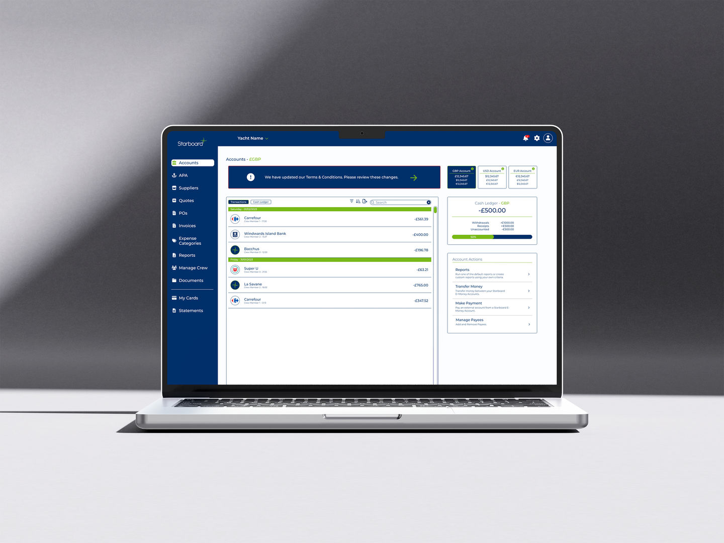
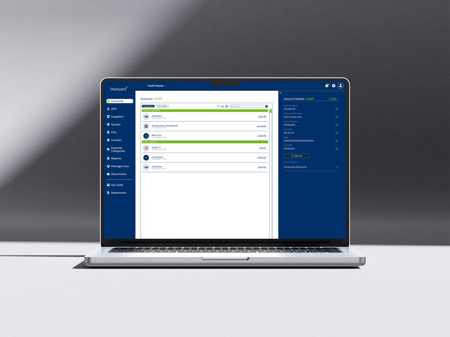
The desktop context allowed significantly more information to be presented at once, but that freedom required careful consideration. The design process involved multiple rounds of layout experimentation in Figma, testing how much data could be displayed before a screen started to feel overwhelming, and finding the right balance between table-based views for bulk data and card-based layouts for individual account management.
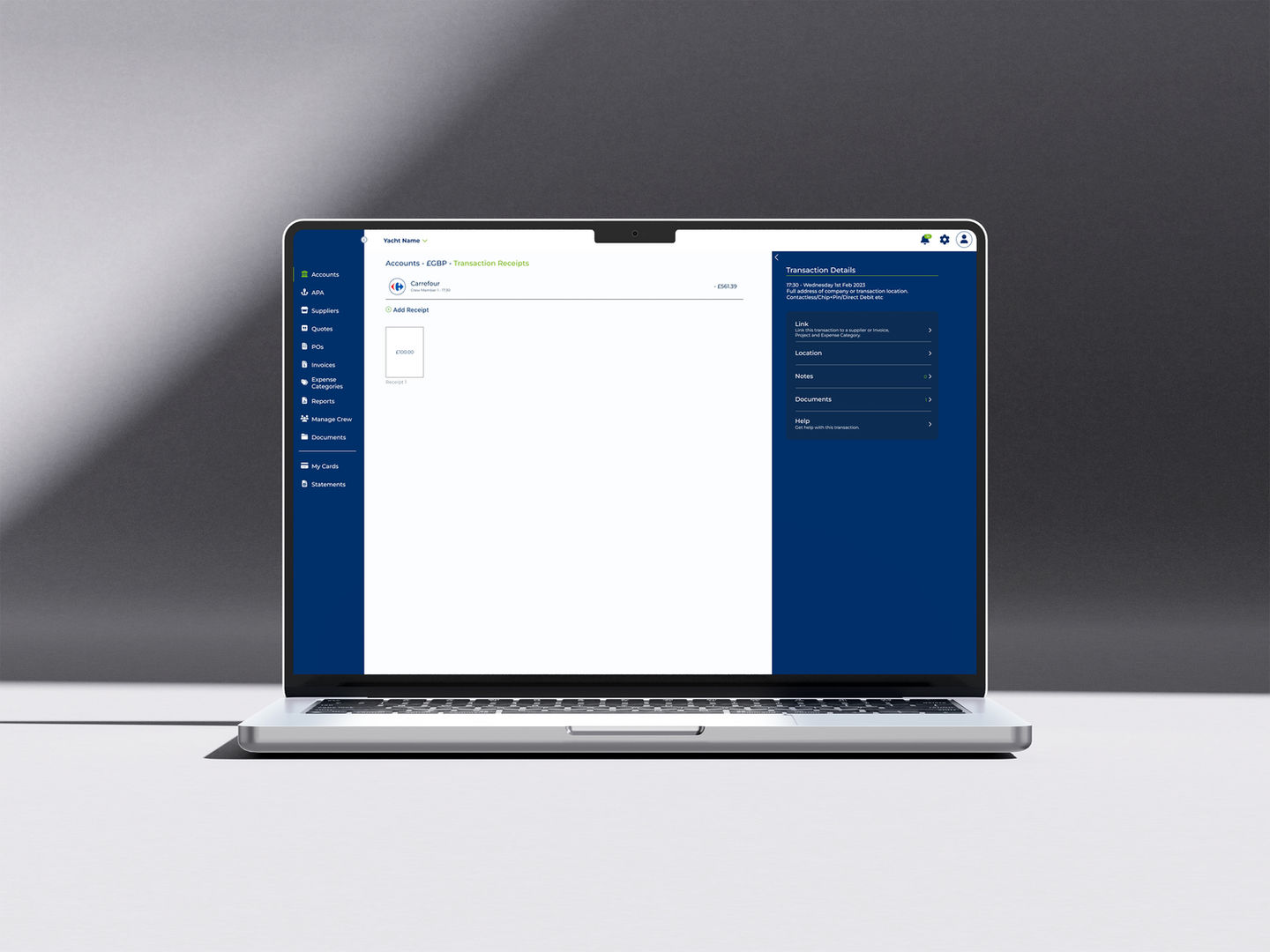
Particular focus was placed on the transaction detail views. Where a manager needed to see receipts, location data, and full audit trails for any given spend, and on the reporting workflow, which needed to be both flexible and opinionated enough to produce useful outputs without requiring extensive configuration each time.
Accessibility and navigation clarity were prioritised throughout, ensuring users could move efficiently between accounts, vessels, and reporting functions without losing context or requiring unnecessary back-navigation.
Outcome
A cohesive cross-platform product
A scalable desktop platform that maintains visual and logical consistency with the mobile app, giving users a coherent experience regardless of which surface they're accessing from.
Multi-vessel oversight, team permission management, and detailed financial reporting in a single interface, addressing the core needs identified during research.
A design that scales from occasional users (yacht owners checking in on spending) to daily power users (finance administrators managing multiple vessels).
Lessons Learned
What this project taught me
Cross-platform consistency requires active effort
It's easy to let a desktop product drift visually from its mobile counterpart, especially when the layout constraints are so different. Maintaining a shared design system was what kept both platforms feeling like the same product rather than two separate tools that happened to share a name.
Dense doesn't have to mean difficult
Financial data is inherently dense, but clear typographic hierarchy, considered use of colour, and a well-structured grid make a significant difference. The discipline of constantly asking "what does the user need to see first here?" shaped most of the layout decisions on this project.
Understanding user roles is foundational
Designing for one generic user would have produced a platform that served no one well. Understanding the distinct roles and contexts and designing explicit pathways for each, was what made the platform genuinely useful across a diverse user base.
Only a selected portion of screens are shown here. As the platform remains under active development, several areas are confidential or unavailable for public showcase. The designs shown are conceptual representations created for portfolio purposes and do not reflect live data or sensitive production information.
Working on something similar?
I'm available for UX/UI and product design work. Let's talk about your project.