Print-ready packaging and label design for a multi-sensory branding agency
SOH Group is a multi-sensory branding and marketing company, using scent, sight, sound and design to elevate their clients' brands. Working freelance as Seaden Design across 2022–2023, I produced print-ready artwork for their product packaging and labels, visualised in 3D for client sign-off before every print run.
RoleFreelance Packaging & Label Designer
Duration2022 — 2023
LocationRemote, with SOH Group's studio
TypePackaging, Label & Product Visualisation
Overview
A multi-sensory branding agency with a broad product roster
SOH Group is a multi-sensory branding and marketing company, using scent, sight, sound and design to elevate their clients' brands. Their work spans hospitality, retail and lifestyle brands, each with its own products, packaging and labelling to maintain across a wide and constantly evolving range.
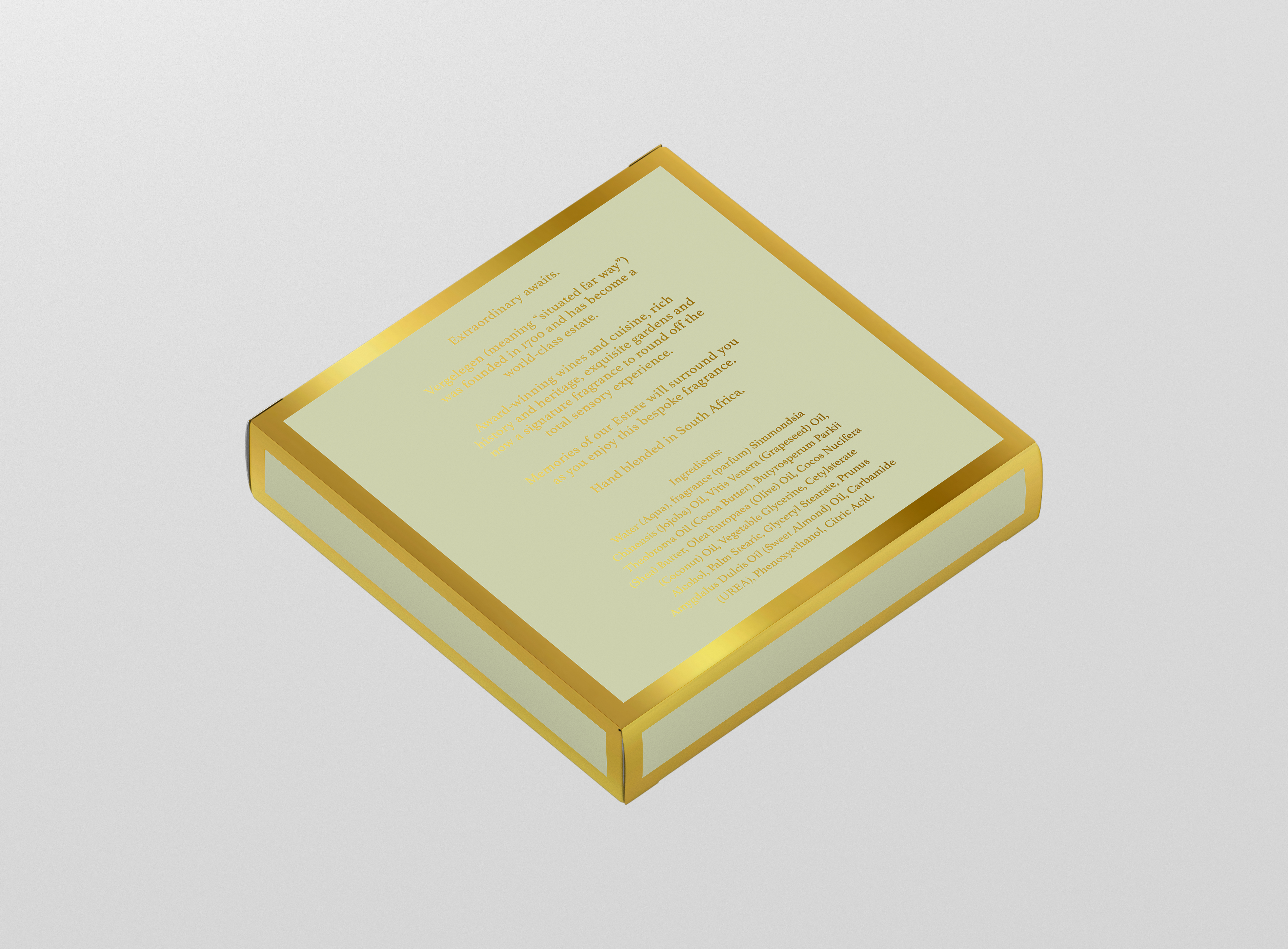
I worked with SOH Group on a freelance basis as Seaden Design from 2022 to 2023. My role was to produce print-ready artwork for their product packaging and labels, including the safety and compliance information required on each pack, ready to be sent straight to the printers.
The Brief
Print-ready artwork, on brand, every time
Each project started life as a die cut: the flat, technical template a box or label would eventually be printed and folded from. The job was to design directly onto that die cut, working within fixed panel dimensions and fold lines while still producing artwork that felt considered and true to each individual brand.
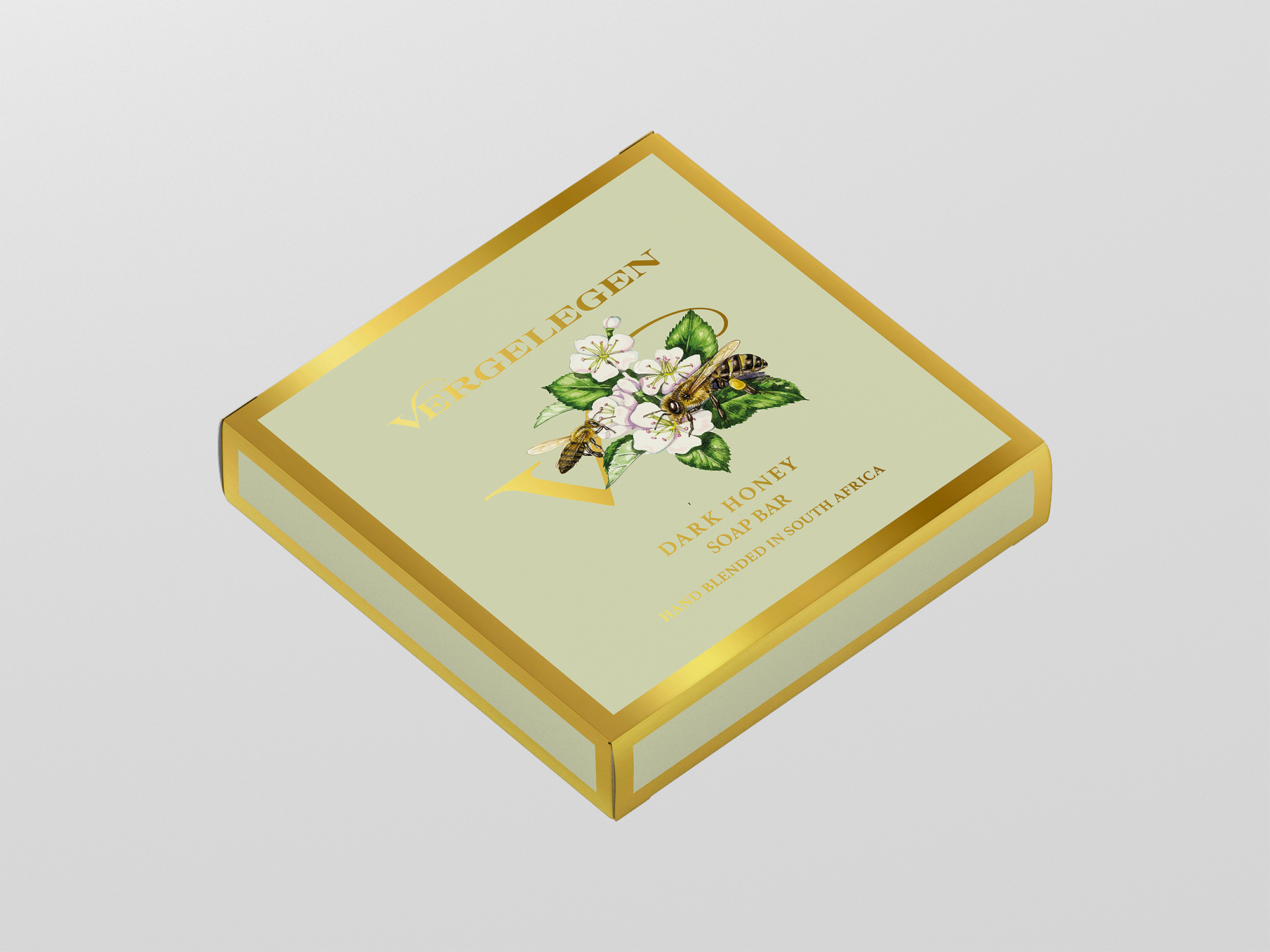
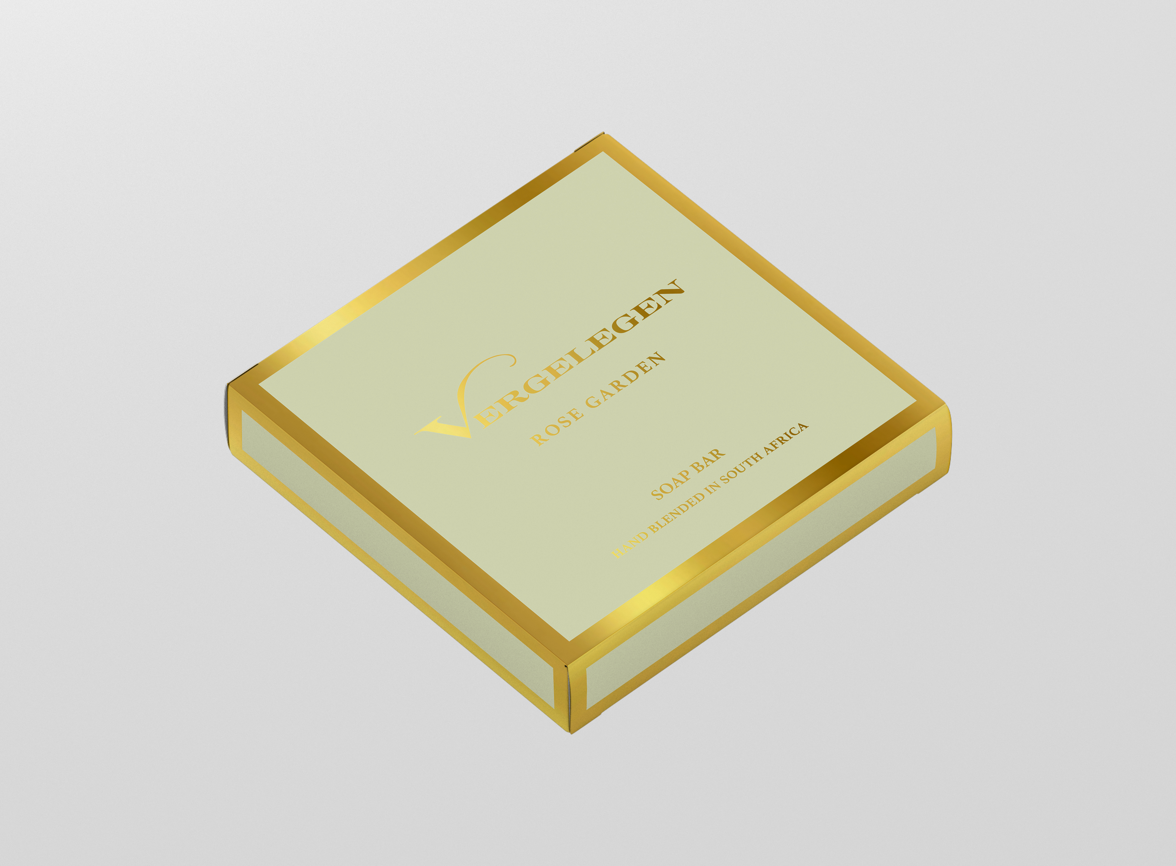
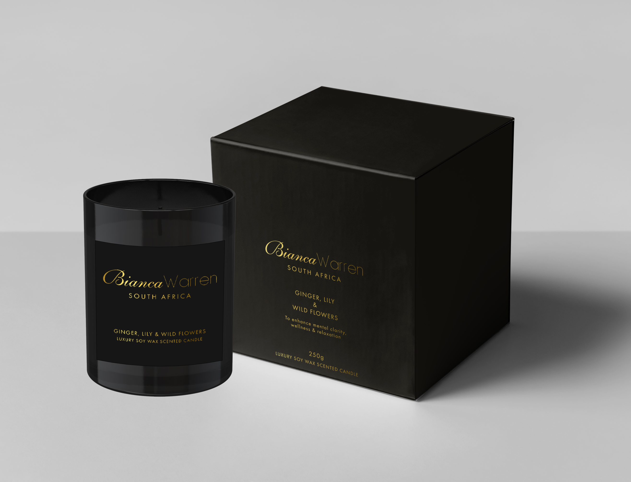
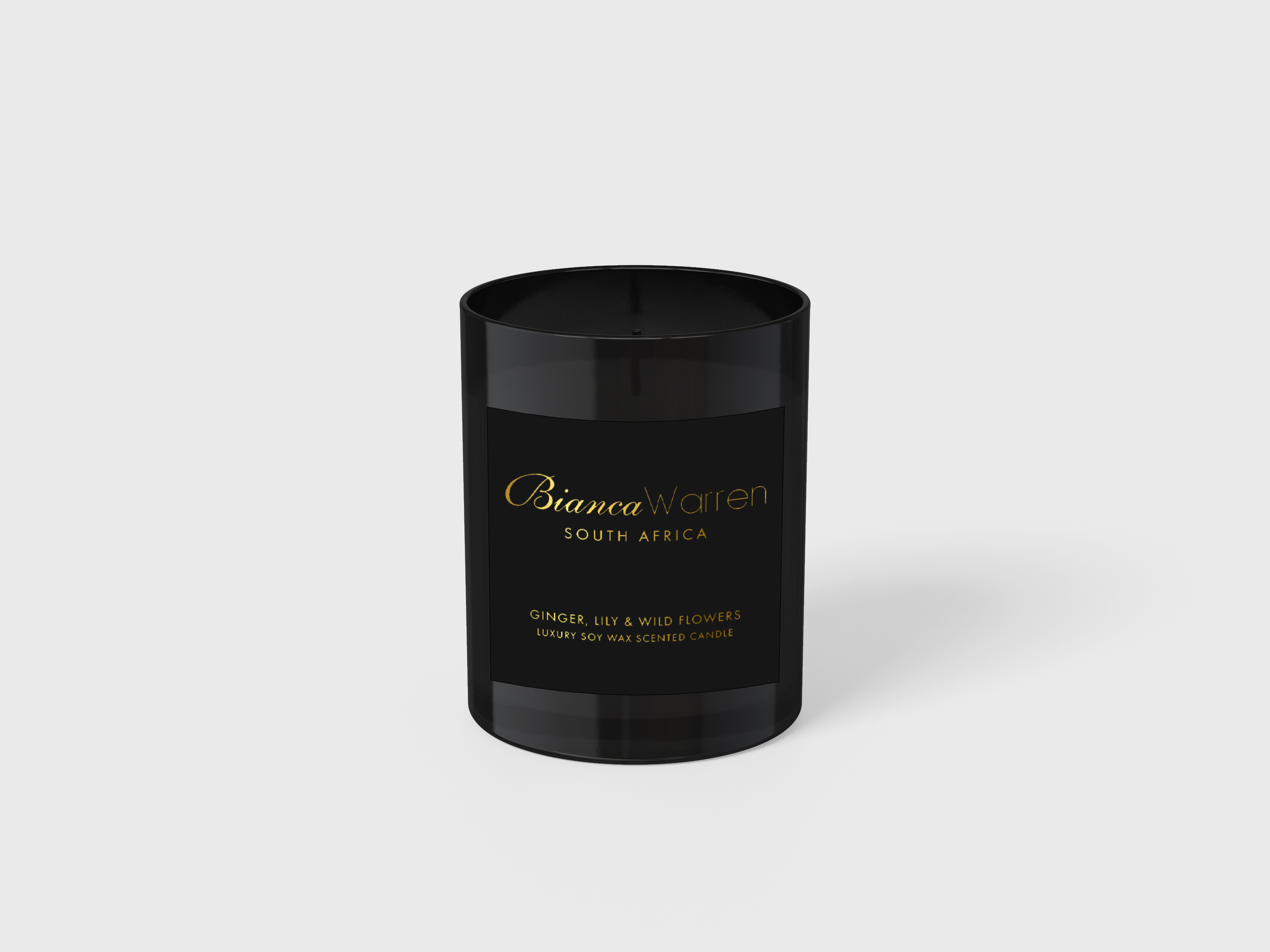
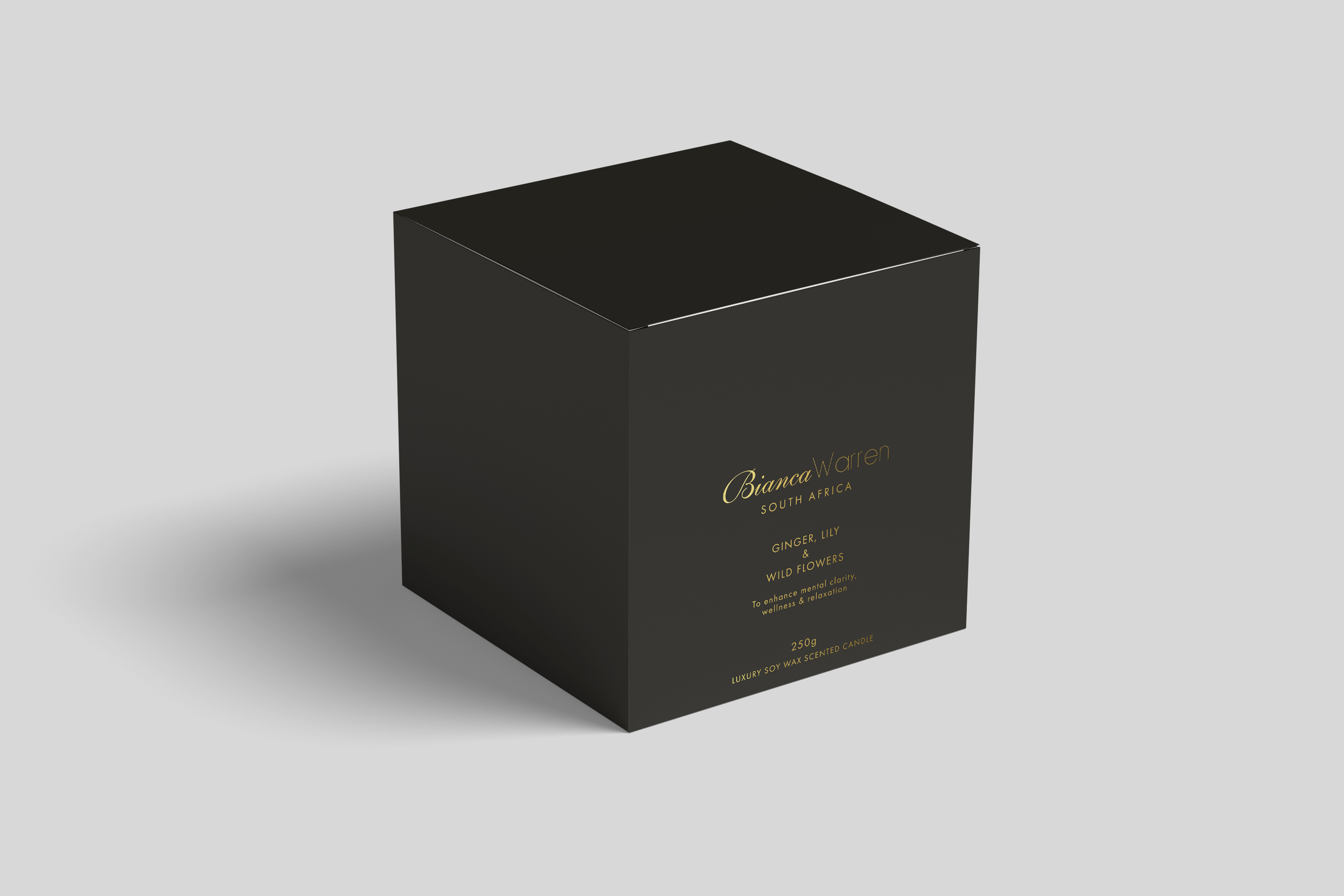
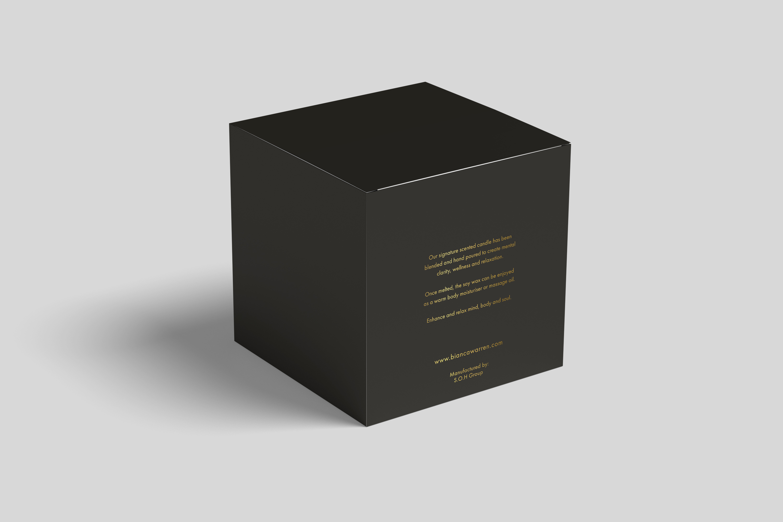
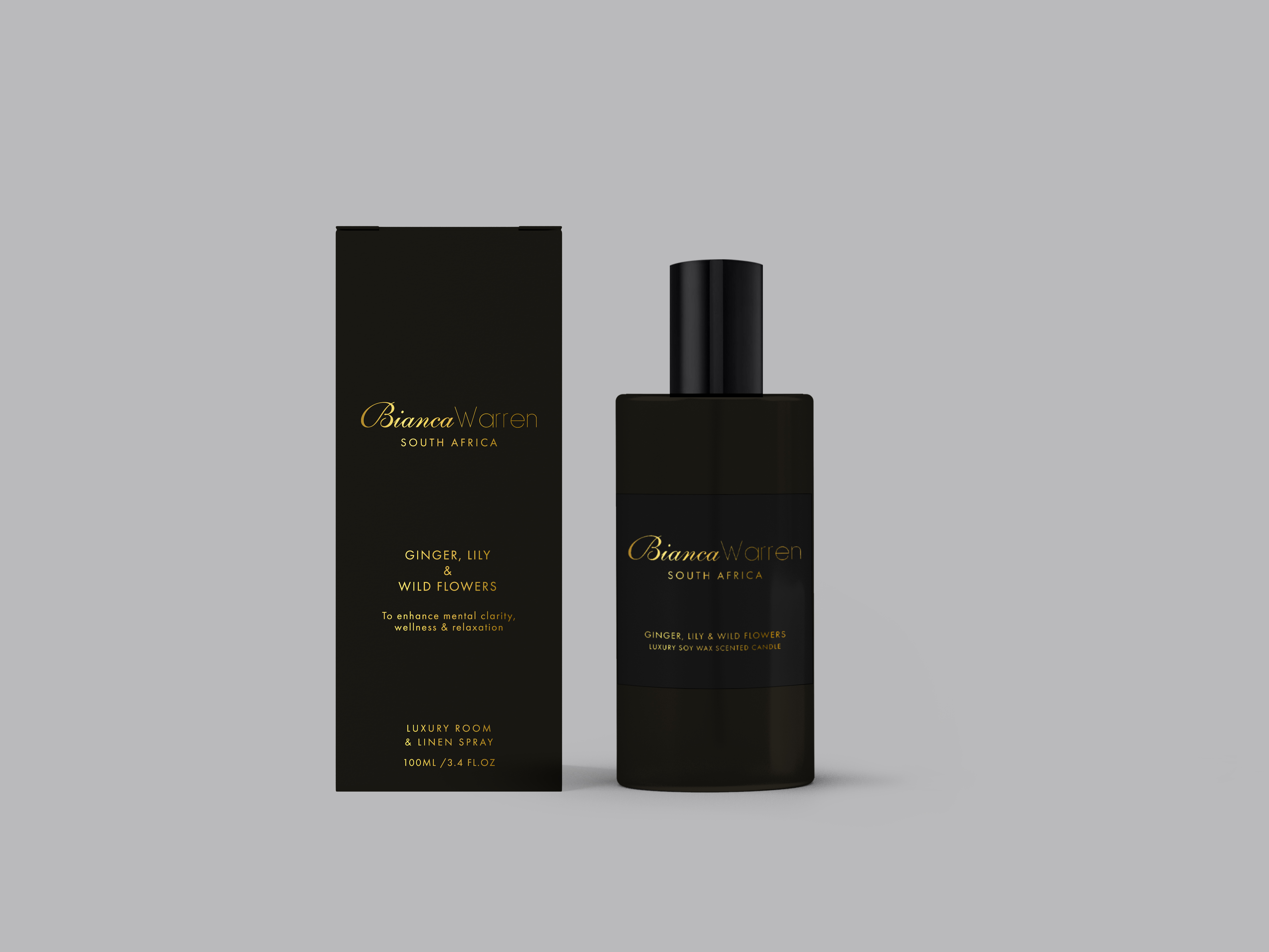
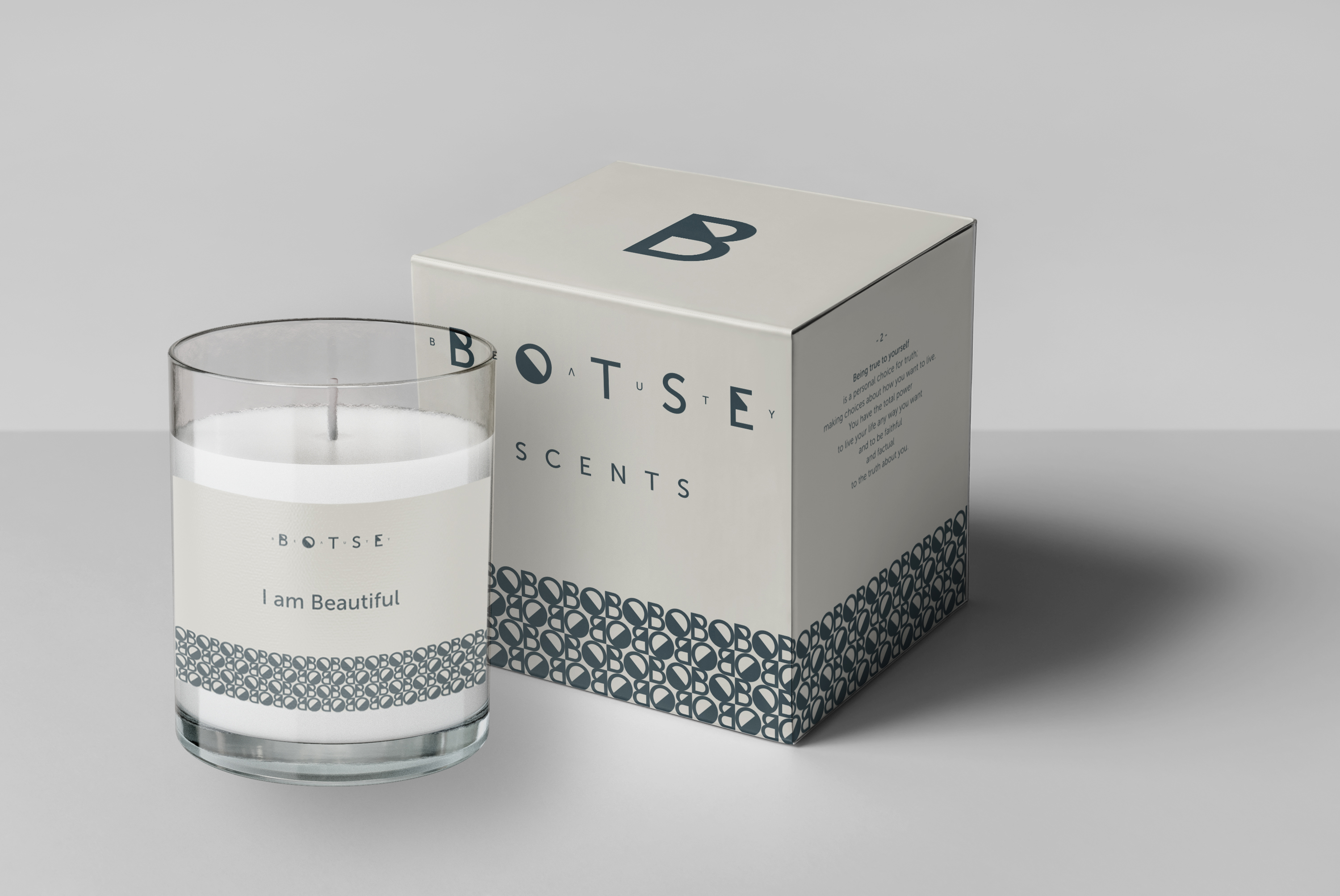
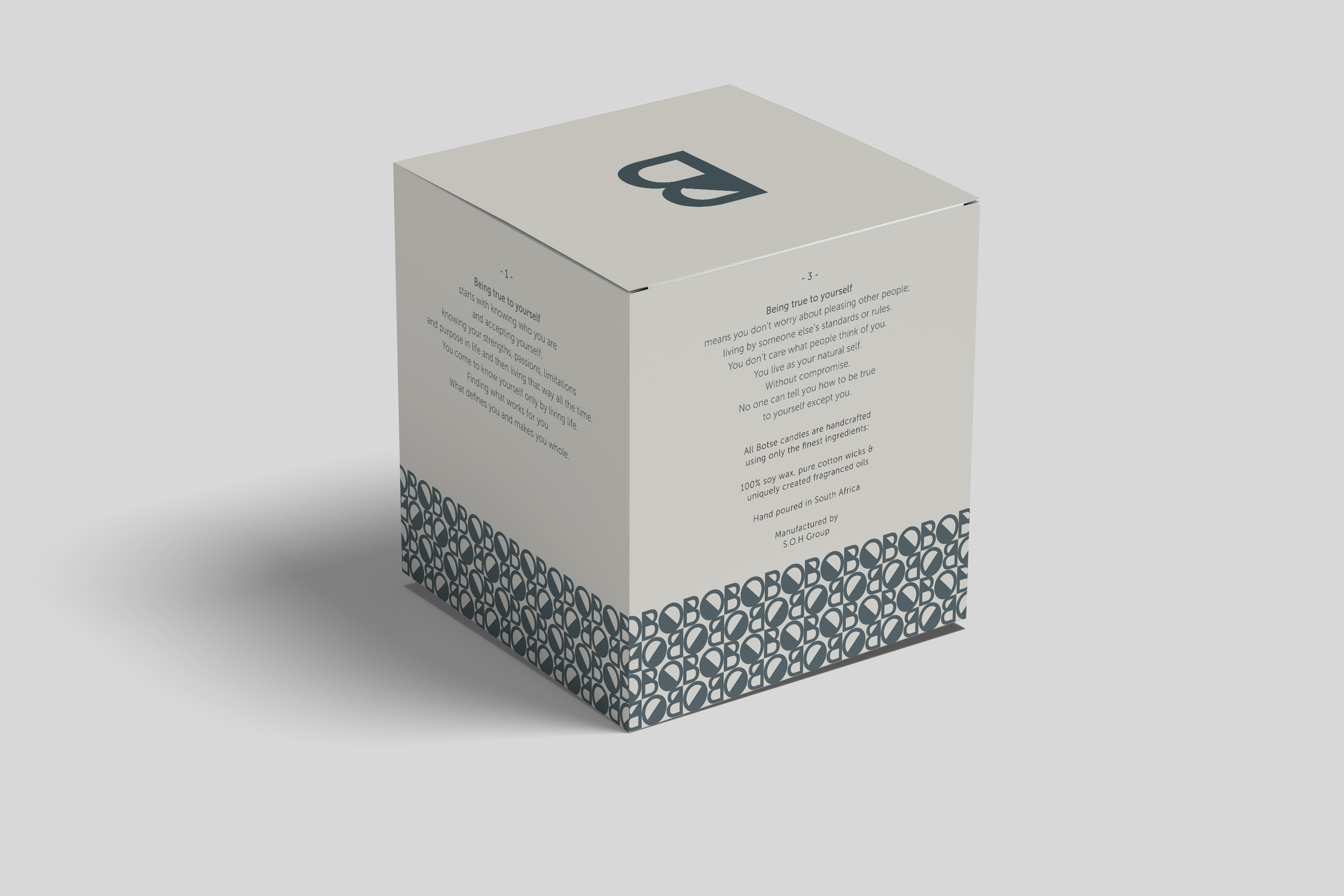
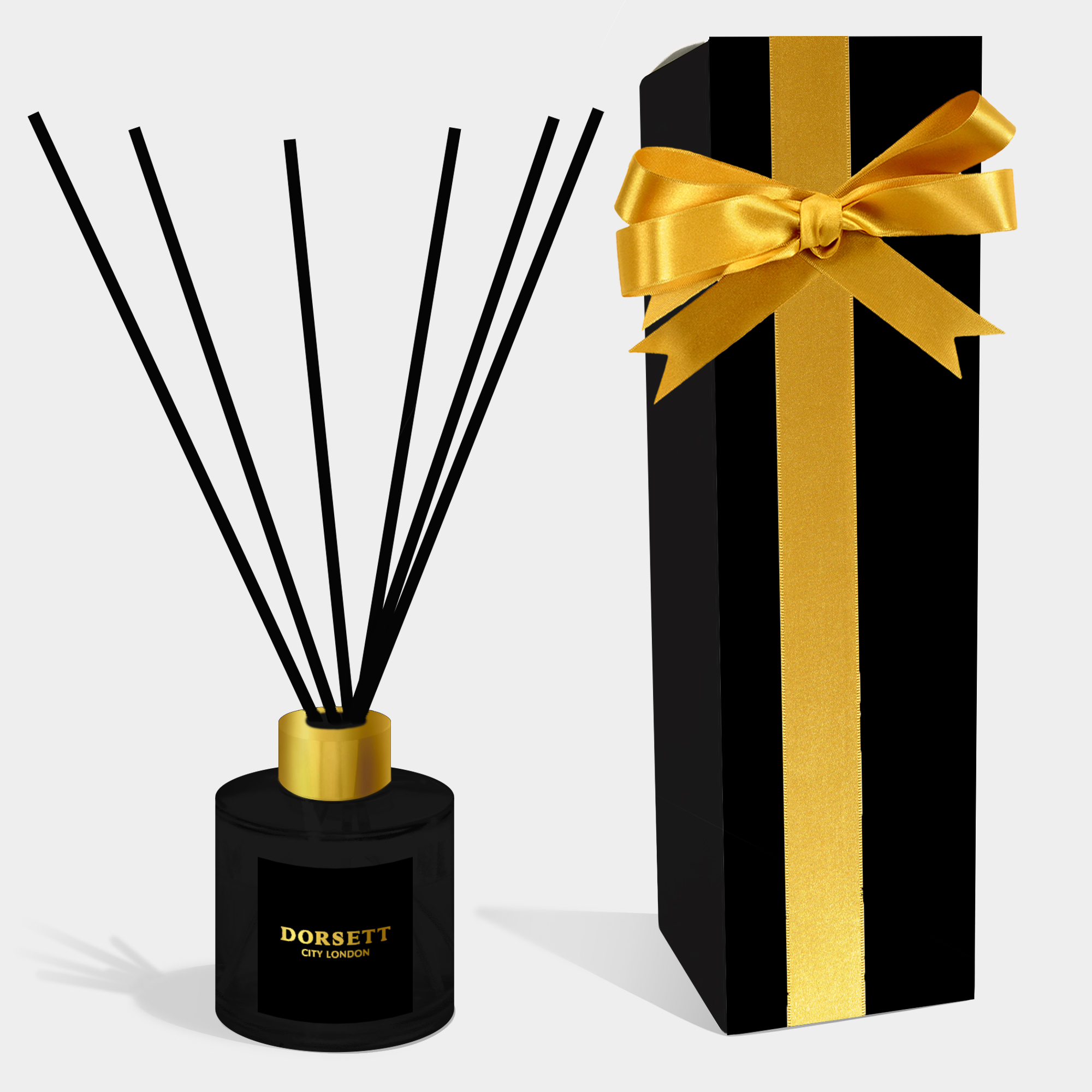
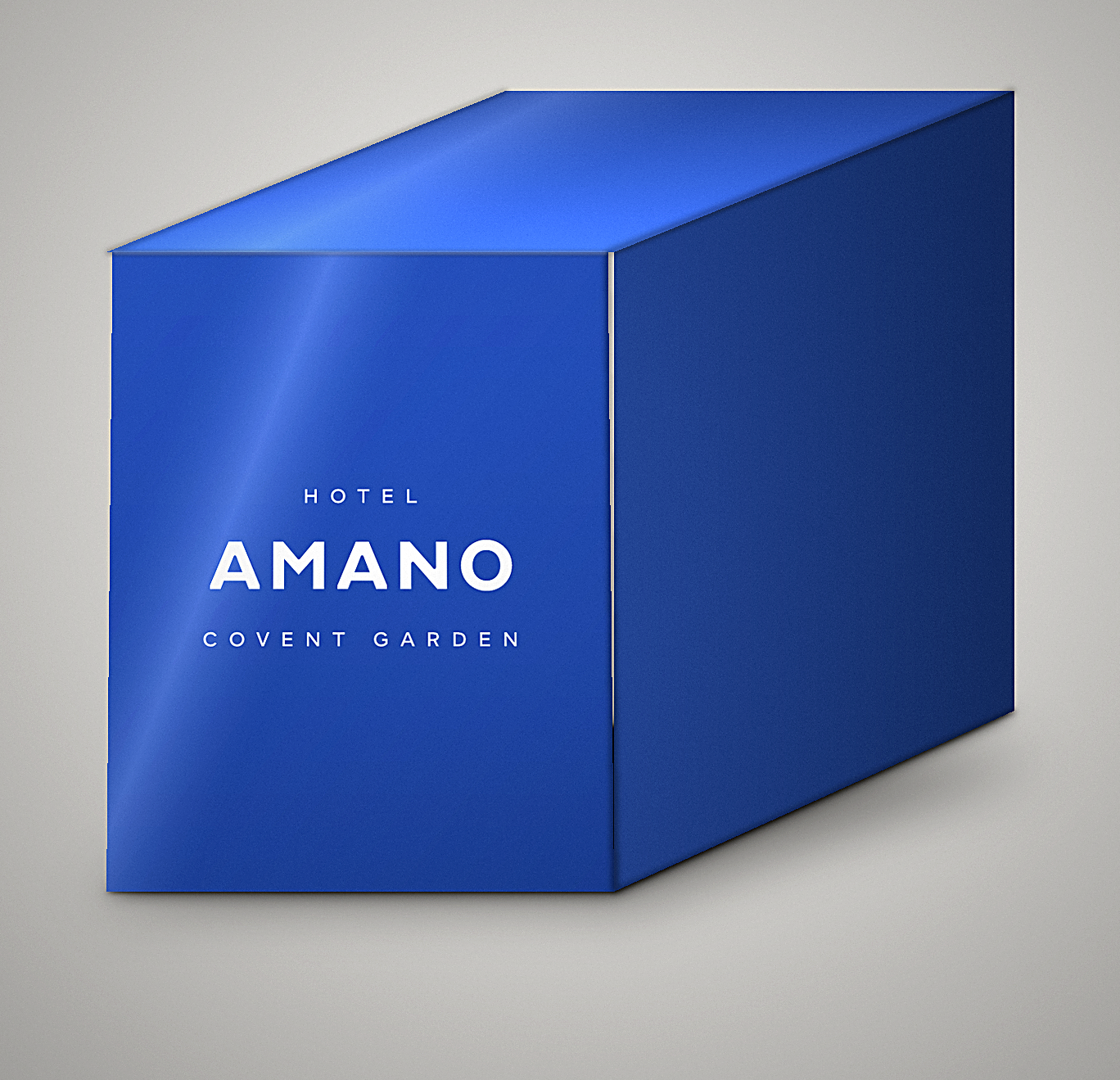
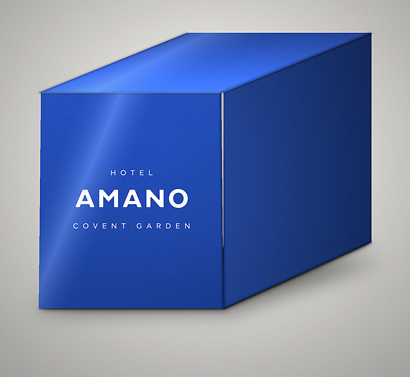
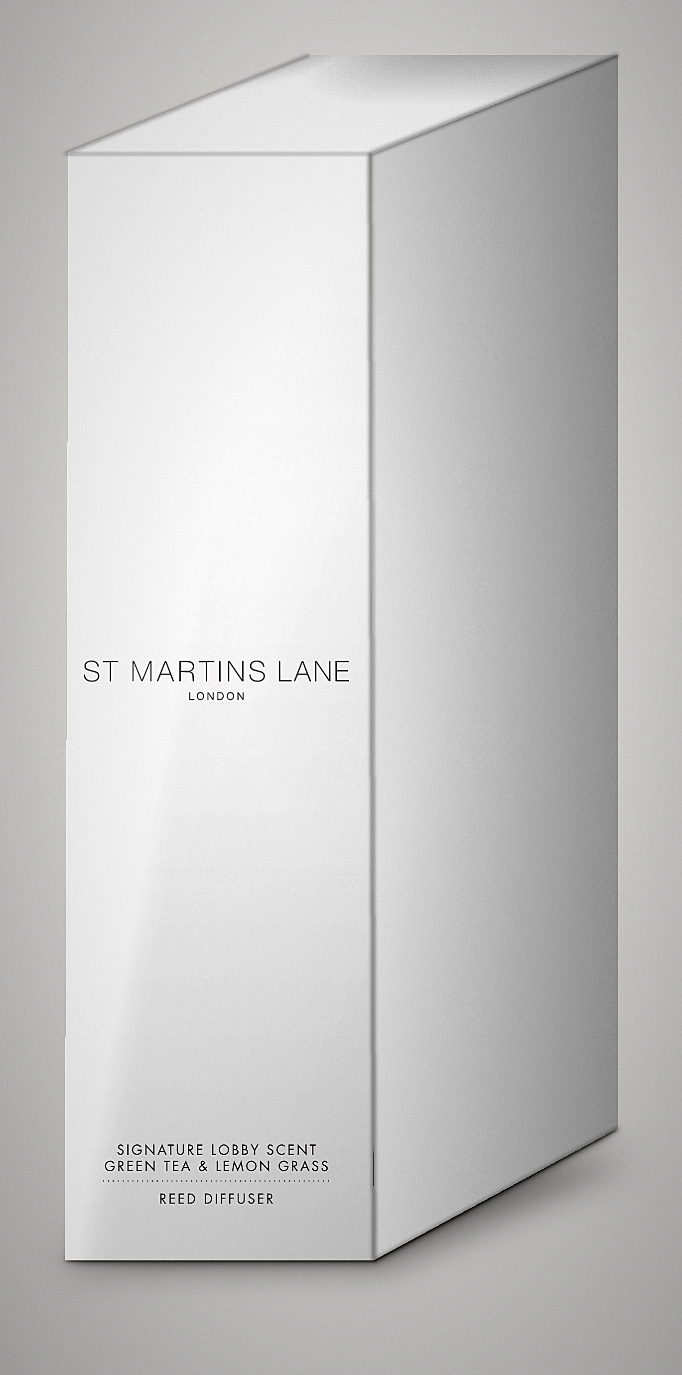
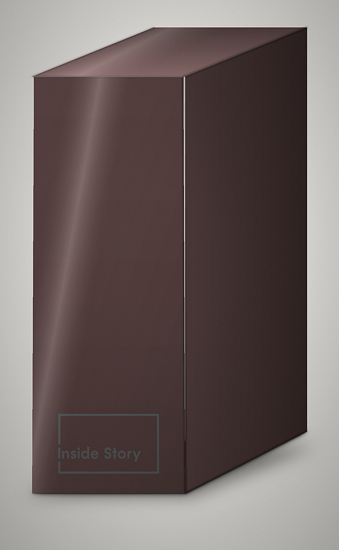
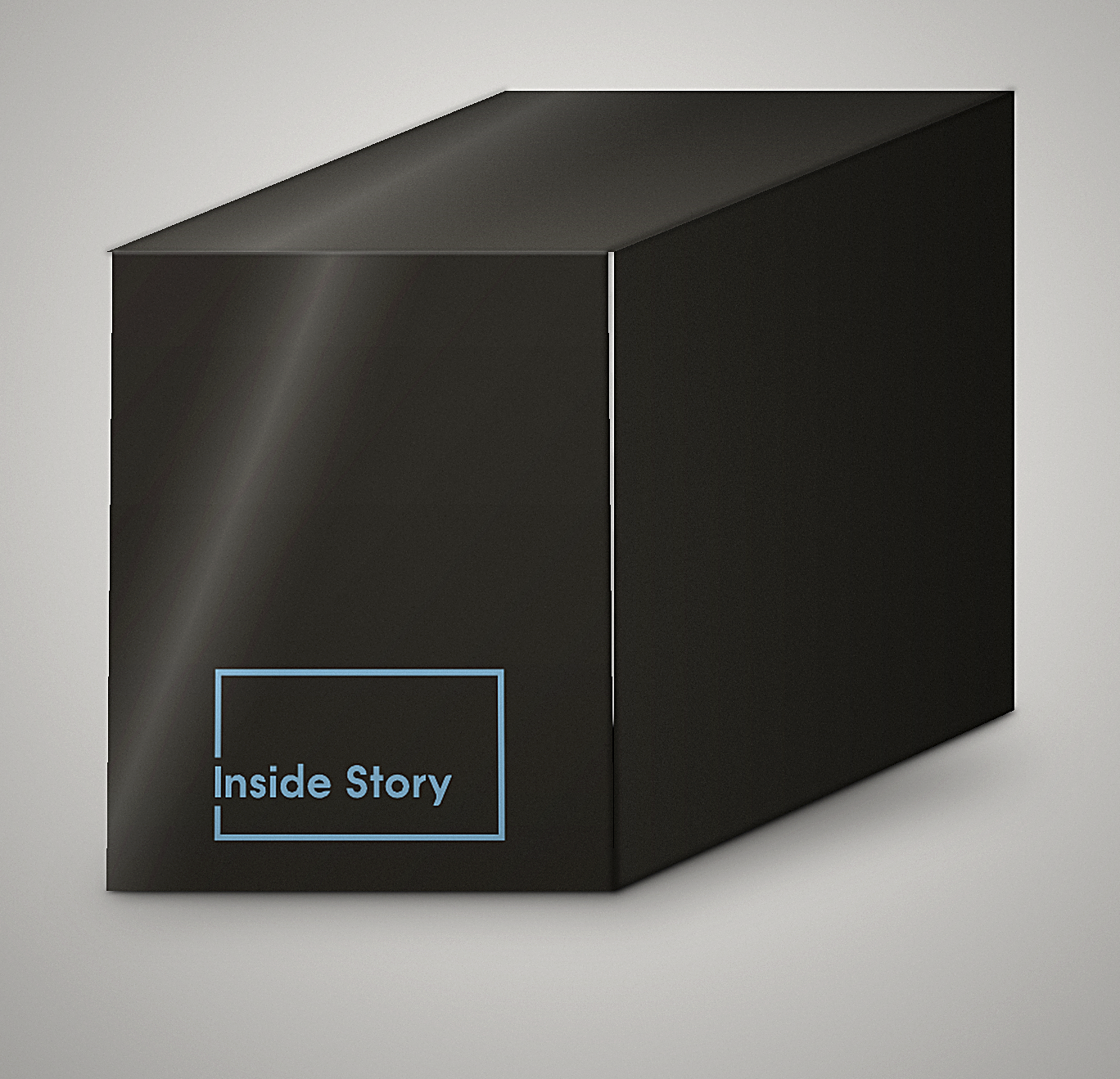
Because a flat die cut is difficult for a client to picture as a finished product, the designs needed to be mocked up as 3D visuals before anything went to print. This gave clients and their stakeholders a realistic view of the finished packaging, and the chance to sign off, or request changes, before a print run was committed to.
Process & Software
From die cut to print-ready to client approval
Packaging and label artwork was built in Illustrator, working directly on each product's die cut so that every panel, fold and bleed lined up correctly ahead of print. This was the foundation of every project, whatever the product.
Where a suitable product mockup already existed, Photoshop was used to place the finished artwork onto it, giving a quick and realistic preview without the need for a full render. Where no mockup was available, whether for a new box shape, a bespoke label, or a product with no off-the-shelf template, the packaging was built and rendered from scratch in 3ds Max using the VRay renderer, producing photorealistic visuals clients could approve with confidence before print.
Throughout, I liaised frequently with SOH Group's owners and directors to stay on track and on brand. That close, consistent communication made for a smooth workflow across the whole year, with feedback turned around quickly and few surprises at the print stage.
Deliverables
What was produced
Die-cut packaging artwork (Illustrator)
Product & retail label artwork
Safety & compliance information
Photoshop mockup placements
3D product & packaging visuals (3ds Max + VRay)
Client-ready approval renders
Outcome
A year of steady, on-brand production
A steady stream of print-ready packaging and label artwork delivered across the year, with 3D visuals giving clients confidence to approve designs before they went to print.
A close working relationship with SOH Group's owners and directors, built on frequent communication that kept every project on track and on brand.
The gallery below shows a small selection of the work produced for SOH Group. Many more projects came up over the year, but the core focus throughout was product and packaging design.
Lessons Learned
What this project taught me
Accuracy on the die cut is non-negotiable
Designing directly onto a die cut leaves no room for guesswork. Every fold line, tab and bleed had to be respected exactly, since a misaligned panel is the difference between artwork that prints and folds cleanly and a box that doesn't close properly.
A flat die cut and a finished product are two different things
Clients think in finished products, not technical templates. Building 3D visuals into the process, rather than treating them as an afterthought, made approvals faster and gave everyone real confidence in how a design would look once printed and assembled.
Frequent, direct communication is worth the time
Staying in regular contact with SOH Group's owners and directors, rather than working from a brief in isolation, kept every project aligned with the brand and meant issues were caught early rather than after print.
Need packaging or label artwork?
From die-cut packaging to product visuals, I can help take your product from design to print-ready.