Bringing one of music's most iconic brands into physical space
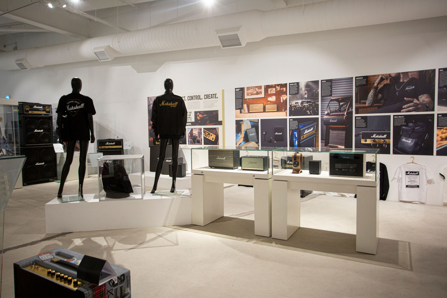
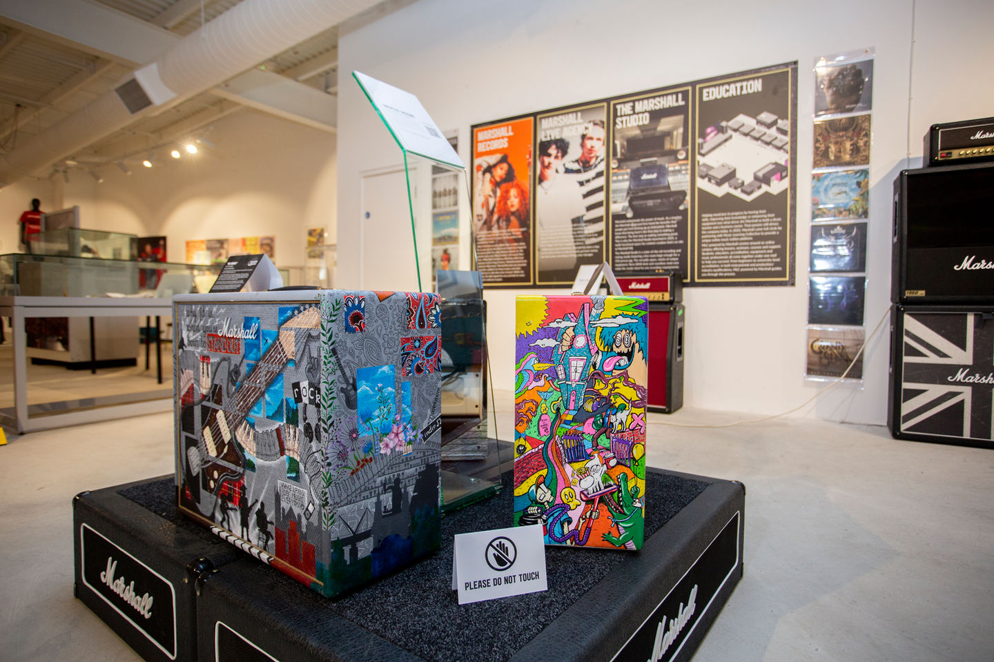
Promotional pull-up banners, event signage, and a museum-scale exhibition charting the full story of Marshall Amplification, translating a brand built for stages and screens into physical, walk-through environments.
Marshall's visual identity is built to be instantly recognisable on a screen or a printed page, but part of my graphic design role at Marshall was producing event-specific artwork that brought the brand to life in physical spaces, from promotional pull-up banners used at events and appearances to a large-scale museum exhibition chronicling the company's history and future direction.
This is brand work at human scale. Design that has to hold up when someone is standing in front of it, walking past it, or moving through it, rather than scrolling past it on a feed.
The Challenge
Brand guidelines built for screens, applied to physical space
Marshall's strict standards on logo placement, colour overlays and typography had to remain intact whether the output was a pull-up banner photographed at a trade show or a museum panel viewed up close by visitors. None of the usual screen-based safety nets applied, there's no zooming in to check a detail on a six-foot exhibition panel, and no easy reprint if a banner doesn't read correctly from across a room.
The challenge was less about technical production and more about translation: making the same visual language that worked in adverts and on packaging hold its impact at an entirely different scale and in an entirely different context.
Event & Promotional Artwork
Consistent presence, wherever the brand showed up
Pull-up banners were designed for use across Marshall's events and appearances, following the same strict brand guidelines that governed all of the company's communications, consistent logo placement, structured colour overlays and a unified typographic style that ensured Marshall's presence at any event was immediately recognisable, regardless of the venue or occasion.
Museum Exhibition
A limited-run exhibition charting decades of brand history
The most significant project within this area was a limited-run museum display charting the full story of Marshall Amplification. The exhibition spanned the company's origins and its place in rock history, while also looking forward to the new direction the brand was heading.
Designing for a museum context required a different kind of thinking. It required careful consideration of layout, hierarchy and storytelling to guide visitors through a visual narrative across multiple panels and display elements, while keeping the iconic Marshall aesthetic intact throughout. It demanded a balance between heritage and modernity, honouring the brand's legendary status in music while presenting its evolution in a way that felt fresh and forward-looking.
Deliverables
What was produced
Event pull-up banners for appearances & activations
Promotional event signage & collateral
Museum-scale exhibition design & layout
Multi-panel exhibition storytelling & hierarchy
Brand-compliant display elements for physical environments
Outcome
A brand presence that held up off the screen
Delivered a museum-scale exhibition translating decades of brand heritage into a visual narrative for public display.
Maintained Marshall's exacting brand standards across every physical touchpoint, from trade show banners to gallery-scale panels.
Gave the brand a consistent, recognisable presence at events and appearances across multiple years.
Lessons Learned
What this project taught me
Physical space demands different thinking than screens
A layout that reads perfectly on a monitor doesn't automatically work at six feet tall or viewed from across a room. Designing for exhibitions and events meant constantly testing scale, sightlines and legibility in ways that screen-based work never requires.
Heritage and modernity have to coexist, not compete
The museum exhibition had to honour decades of brand history without feeling like a relic. Finding the balance between nostalgia and forward-looking design was as much a curatorial challenge as a visual one.
Guidelines are a foundation, not a constraint
Applying the same strict brand rules across totally different physical contexts, banners, panels, signage, proved that consistency and creative freedom aren't opposites when the underlying system is strong enough.
Need brand design for physical space?
From event artwork to exhibition design, let's talk about what's possible for your business.