Onboard finance management for the superyacht industry
A multi-year UX/UI design engagement on a fintech product built specifically for yacht owners, crew, and management companies — combining payments, budgeting, and financial reporting into one seamless mobile experience.
Over the course of its development, Starboard Card evolved from an ambitious concept into a refined onboard finance platform built specifically for the superyacht industry. The application was designed to bring greater transparency, flexibility and control to onboard spending, addressing a genuine gap in how financial operations are managed at sea.
Working as one of two designers in a fast-moving startup environment, I played a key role in shaping the product's user experience and visual direction from the ground up. The platform officially launched in early 2026 following an extended period of research, iteration, and testing.
The Problem
Financial management onboard is genuinely hard
Superyacht crews face a distinct set of financial challenges: multi-currency spending with no clear oversight, accountability gaps between crew members and owners, and the near impossibility of reconciling expenses in real time while at sea. Existing tools, largely legacy banking apps or spreadsheets, simply weren't built for this context.
The brief was to design something that felt premium and trustworthy, appropriate to the luxury sector, while solving real operational problems for people who aren't necessarily finance professionals. Transparency, reliability, and simplicity were the core design principles from the outset.
Research
Understanding the realities of life onboard
The research phase was central to the design process. Through user interviews and ongoing conversations with captains, crew members, yacht owners and management companies, we built a clear picture of how financial decisions are made and managed at sea, and where the pain points were most acute.
Competitor analysis of existing fintech and expense management tools helped identify both the conventions users were already familiar with and the significant gaps that a purpose-built solution could address. These findings informed the entire information architecture of the application, from how accounts are structured to how spending is categorised and reported.
Key research findings shaped early design decisions. Crew needed quick access to card controls during transactions, owners and captains required clear budget visibility across the whole vessel, and management companies needed consolidated reporting without having to chase individual crew members.
Design Process
Iterative design across multiple product stages
The design process moved through early wireframes in Adobe XD and Figma through to polished high-fidelity prototypes, with multiple rounds of stakeholder review and usability testing in between. The product went through several significant iterations as both the feature set and the team's understanding of user needs developed.
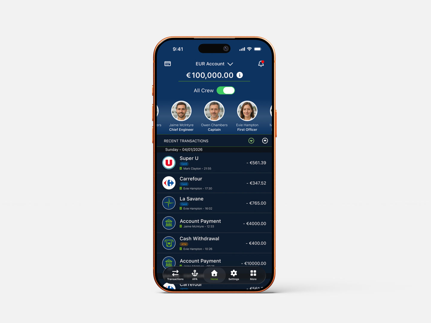
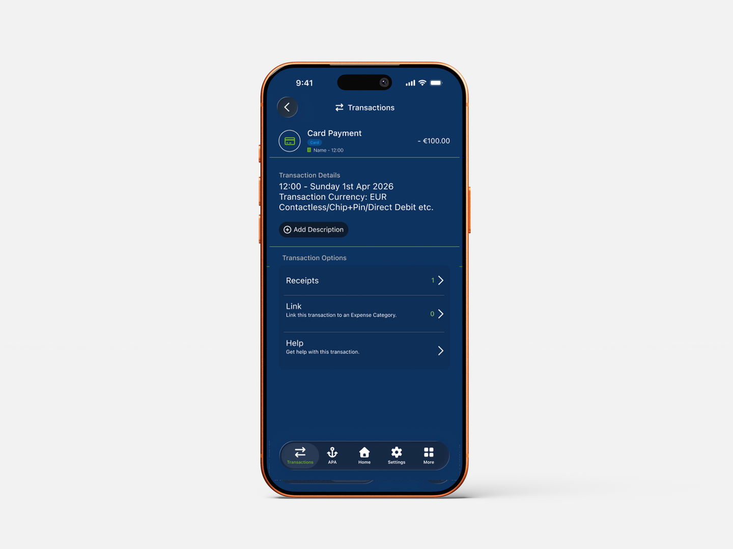
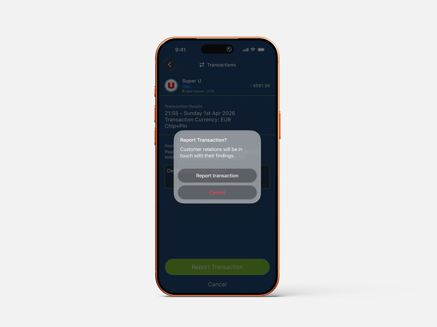
Key design challenges included making complex financial data, multi-currency balances, transaction histories, budget pots, scannable and actionable on a small screen, designing fraud reporting flows that balanced urgency with clarity, and maintaining a design language that felt premium enough for the luxury market without sacrificing usability for everyday crew tasks.
A design system was developed in Figma to maintain consistency across an expanding set of screens, reducing decision-making overhead and ensuring the product scaled coherently as new features were added throughout the engagement.
Flow in detail
Inviting a new crew member
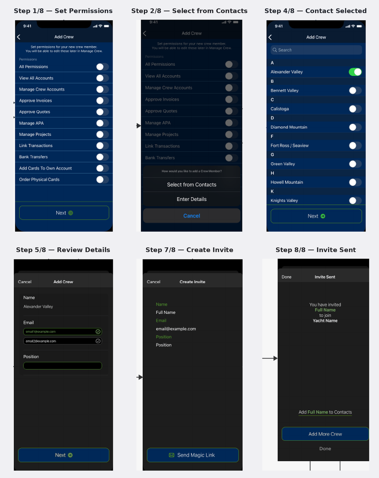
One of the flows refined through several rounds of testing: an owner selects an existing contact, confirms their details, and sends an invite via an emailed magic link — reduced to as few taps as possible for someone managing crew from a moving vessel.
Outcome
A live product handling real transactions
Successfully launched in early 2026 after an extended development and testing period, handling live multi-currency card transactions for real users at sea.
A coherent cross-platform product suite, mobile app, web application, and internal admin panel, designed to work as a unified system rather than isolated tools.
A Figma design system that enabled rapid iteration and gave the development team clear, consistent specs throughout the build process.
A product that passed regulatory scrutiny while maintaining a user interface that felt calm and straightforward rather than bureaucratic.
Lessons Learned
What this project taught me
Design systems pay off early
Building a coherent component library from the start, even before the product was fully defined, saved significant time during later iterations and made it much easier to maintain consistency across platforms.
Context shapes everything
Designing for users who are physically at sea, often dealing with urgent situations, reinforced the value of radical simplicity. Every tap of friction that seems minor on a wireframe becomes a real problem when someone is managing a card dispute from a moving vessel.
Startup pace demands flexibility
Working in a small team with a rapidly evolving product required being comfortable making big decisions quickly. Learning to distinguish decisions that needed careful deliberation from those that just needed a good-enough answer was a core skill developed across this engagement.
Only a selected portion of screens are shown here. As the platform remains under active development, several areas are confidential or unavailable for public showcase. The designs shown are conceptual representations created for portfolio purposes and do not reflect live data or sensitive production information.
Working on something similar?
I'm available for UX/UI and product design work. Let's talk about your project.